Roxanne Caritey
Graphic designer and animator

Project 1:
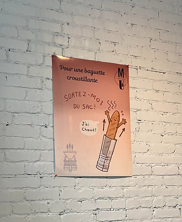
poster Design- Baguette
The owners commissioned me to design a graphic for a poster that would communicate to their customers that the baguettes sold needed to be removed from their packaging after purchase as they could get too hot and lose their crunchiness. They asked for a design that was cartoony and playful, showing a happy baguette being visibly warm.

brief
Final illustration
challenges
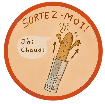
When designing the baguette, I came across some design challenges when it came to illustrating the heat.
Originally, the owners wanted the baguette to be slightly bent over to show it becoming soggy. However, given the shape and the insinuation of warmth, I felt the design could be misinterpreted in a vulgar way.
I decided to keep the baguettes original shape but give it some sweat marks and steam to suggest warmth. The arrows also show to the buyer that the bread needs to be taken out.
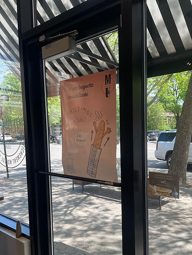
Poster in bakery
other ideas
In the beginning, the owners wanted a round format so they could turn it into a sticker that they would put on each baguette bag, so that each customer could see it.
Upon further reflection, the owners realized that a poster would be more efficient as it would cost less and avoid the labour that putting individual stickers would involve.
Alternative design
fINAL POSTER IN BAKERY
The poster was designed by someone else. The hand written font and the baguette design was made by me.
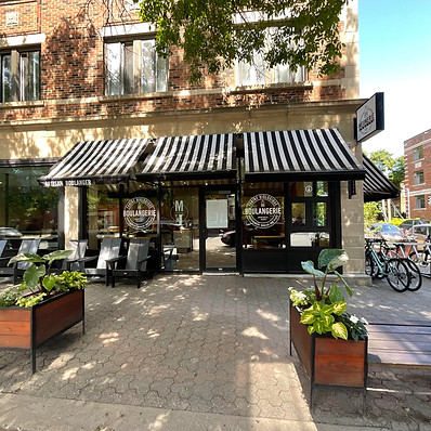
Front door of bakery
Project 2
Self-check out machine design
brief
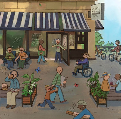
The owners commissioned me to also design a front page cover for their new self-service check-out machines. They wanted a drawing of the front of the bakery that would show the liveliness of the bakery and its numerous customers. The design needed to reflect the community that supports the bakery as well as put forward all the products they offer.
Outside of bakery
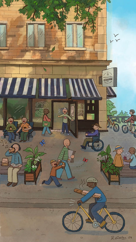
Final illustration
challenges
My main challenge with this piece was that the owners insisted on not representing any discerning features. In other words, they didn't want the characters to be identifiable in gender and race so that customers would not associate with them.
Although I did not agree with this idea and felt it took away from the appeal of the image, I still tried to simplify my characters so that their actions and relations would be highlighted, only representing age and skin color.
concept
With this project, I felt it was important that the front page reflects the people that would use it. Therefor, I wanted to show a diversity of people who frequently shop at the bakery. There's a parent and their child, someone reading, friends talking, a wheelchair users, and more.
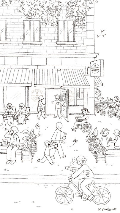
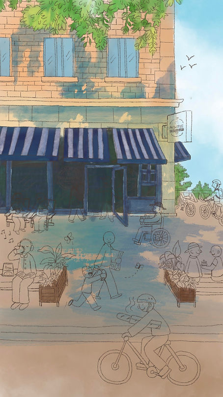
Sketch
Close up
colors
For the colors, I wanted to make them bright and summery to bring life to the illustration. I also tried to stick to a strict color palette as to overcrowd the piece which is already packed with details.
I also tried to incorporate texture to suggest a hand-painted feel which the owners wanted to have. That way the hand-made qualities of their products would be continued in this illustration.